PRODUCT DESIGNER
I help companies to make their user's interaction experience fun and enjoyable while at the same time increase their ROI by implementing significant UX improvements.
I always strive for simple aesthetic solutions and usability. I love finding creative solutions, based on the outcome of in-depth research and data analysis.

Selected Projects
complex workflows with many user types
User Research
One of the first things I did at Hillebrand was interviewing stockholders and conducting several user testing sessions.
One of the most significant insights from my research was the fact that most of the users had very little knowledge of international logistics and were only subject matter expertise in their job areas.
This influenced the architecture of the system: instead of designing for a primary user type, we had to design functionalities for many secondary persona types.
Challenge
User research is crucial at Hillebrand because of the complex workflows of the many user types that must be accommodated to make the system work. As one of the first designers, I used my interaction and research skills to communicate the value of UX research to stakeholders. I presented all methods I am going to use, calculated time, costs, showed benefits of each method, and how it can be applied.


.png)
I cannot show the majority of work I did at Hillebrand because of proprietary concerns. Below is a sample of some of the projects I directly worked on while working as a Product designer at Hillebrand.
Designing the Notification and Task management system
The Problem (Why?)
Solution
Our web application has failed to provide our customers with an effective solution to:
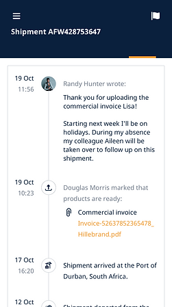
- be informed on time about changes happening to their shipments, like delivery updates or delays
- allow users to manage and complete important tasks
- allow users to communicate with our employees via the platform
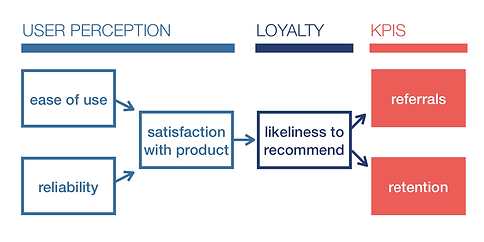
This has impacted the general level of satisfaction and led to many customer complaints.
Our product will address this problem by introducing the notification center; task management functionality and messaging system for communication with our employees.
We will determine how impactful it is by conducting user testing and measuring satisfaction.
Quick research
To get a better understanding of the problem I started with interviewing our customer support employees to find out what were the main issues users were having.
After I had enough data, I conducted a quick competitor's research and looked into the solution some of the key players had (Linkedin, Facebook, Pinterest, and others).
Users (Who?)
Next, I analyzed the goals and needs of each persona and noted down the pain point each persona might have.
It was crucial to get all the stakeholders on the same page, because of the complex workflows of the many user types that must be accommodated to make the system work.
Co-creation workshop ("How might we"/Design Sprint)
1. I started by writing down the main goal and main questions we had to answer; after I draw a basic flow and asked everyone in the room to comment and provide insides.


2. We used a "How might we" exercise to think of all possible problems and questions we might have and after cards were ready we placed them on the board and grouped them into categories.
3. We picked one problem with the highest priority and mapped as many solutions as we could, later shared our decisions, and marked the best ideas we wanted to implement.


The design process
Discovery/Exploration Phase
First, I had to decide on the architecture model we are going to use for this task.
I mapped out six possible scenarios with all the pros and cons.

Taking into consideration my findings and ideas generated during the workshop I have decided to implement a mixed model for Tasks and Notifications
-
The global Activity feed is going to be transformed into an activity feed per shipment.
-
Notification Center becomes one of the options in the navigation menu.
-
Messages are another option at the top navigation menu.
-
Tasks - initial idea was to have them as a separate option in the nav menu (similar to Facebook, Linkedin approach), but taking into consideration the research findings (this feature is going to be used only by 20% of all the users) I decided to place them in a less prominent location - the left side menu.
-
Tasks assigned to the user will generate a notification.
-
Notifications will come from due dates on tasks.

-
The Notification icon together with the User account icon changes it position from the bottom left corner and placed at the top-right corner, so the users can easily find it, no matter what screen size are using.
-
Thinking about discoverability I decided to include a badge with number indicator so that users that are going to access tasks often can easily find them and be aware of how many new tasks do they have.


Notification Center
Once we agreed on the model, I dived into the design of the Notification Center and defining settings.
First, I tried to understand the users' needs and answer some critical questions before moving further.
What notification channels are essential for the users? ( in-app, in-app and email, email, SMS...)
How often will the user receive notifications? (Instant, Digest Daily, Digest Weekly)
How are those notifications triggered? (by user action or system event)
How might we prioritise types of notifications? ( Priority level: critical/needs attention/general)
I grouped all notifications in three categories.


Notifications flyout
Once I had enough information, I started sketching some low fidelity prototypes. I decided to design notifications flyout to provide a quick view of the latest notifications and allow users to react to action-required notification directly from the dropdown.


"Guerilla" testing
What I am going to measure after the notifications and task system is implemented?
Besides some minor finding, I found out that some of the users that were receiving existing notifications were not happy to get mobile push notifications after work and during the weekends. So I came up with the idea of smart notifications settings (a similar approach to the one Slack is using). Now users will be able to manual set day and time for all mobile push notifications.
Most and least notification channels used
Settings: Advanced shipment options – what options are selected the most often
Settings: Flagged shipment usage
Engagement (ex What is the average number of “not see notification“, How many users turned off all the notifications)
Usability issues
My next steps:
-
To conduct several additional User Testings to validate the Tasks feature discoverability.
-
To validate if Notification dropdown is important for the users or if they would prefer to go directly to the Notification Center
-
To work on notifications copy to make them more human
Business outcome
Designing an effective Notifications system helped business to reduce customer support costs. The new design enabled users to get notified about all changes online and save time they spent contacting myHillebrand support department, asking for assistance.
Tasks


See more (Invision)
Dashboard and Shipment Views


Design System

